Hello and welcome back crafty friends! Today I am back sharing a DT card made with the newest release from RachelVassDesigns,Bulbs of Flowers
and just today it is released! It's such a unique and fabulous stamp
set and there are so many possibilities to create something amazing! Oh
and also to help celebrate her new design team she currently has 30% in
her Etsy store until Sept. 8. No code is needed, just go ahead and
shop!
Today I am back to share a card made using the newest digital release from Rachel Vass Designs.....Summer
Fruit Background. This is the perfect summery image and although the
weather has turned a bit cooler here over the last few days, the warmth
is sure to return. But in the meantime and while we are waiting, this is sure to make you
think happy, warm and summery thoughts!
Sometimes simple is best! I am a sucker for a beautiful floral and this
one doesn't disappoint! This floral bouquet is a digital stamp and
it's from a shop on Etsy called StarJamLines. It has a lovely sketchy
look to it and knew I had to have it when I saw it.
Another day, another beautiful floral digital image! Today I am back sharing another digital stamp from Rachel Vass Designs. And yes, I have foiled it again! I will admit that I am a foil addict! I guess there are worse things to be addicted to, right? Sign me up to FAA (foil addicts anonymous) lol
Isn't rainbow everybody's favourite colour? It can't help but put a smile on your face...I know it does mine. This was a super easy card to create with the help of a few inks, a stencil and a fun greeting from a digital stamp set. The other day I had featured a beautiful gold foiled card made with a digital image from gracielliedesign and this sentiment is from another set from her.
Is it okay if I add gold foil to everything? Hello and welcome back! Today I have yet another beautiful digital stamp to share with you all. I have discovered so many fabulous ones as of late and todays is no exception! This beautiful geometric floral is from Rachel Vass Designs and I absolutely adore it! As soon as I laid my eyes on it I knew it had to be foiled....well in all honesty what doesn't need to be foiled?! So off I went gold foil in hand!
Today I have THE sweetest little baby cards ever! I had so much fun making these and yes, although they are a bit more involved, they are so worth it! I think anyone would love to receive a fun and cute card like this when they are welcoming a new little one to the world. The only difference between these 2 cards are the colours for the ink
blending and a slight variation with the sequins used. So let's get
started shall we!
Today I am back with a very simple card made with another beautiful digital stamp that I discovered recently. This gorgeous floral arrangement is from Angie Blom Digital Designs. It's such a pretty arrangement! I am a sucker for a floral and especially one as pretty as this!
So I've discovered a new digital stamp shop, gracielliedesigns and her designs are gorgeous! I just had to get a few and this is one of them. It's one of her new designs and it's perfect as the seasons will be changing soon. This design is so delicate and detailed, the first thing that came to mind was kraft paper and gold foil. Oh...it'll be perfect for masculine cards too!
Hello and welcome back! Today I have an extra card that I had made as part of my AECP level 1 final assignment, but in the end I felt that the colours weren't quite right and as pretty as it is, I just didn't think it went with the rest of the set. So here it is! But I still had to share it with you all!
As you will have seen from my previous post, I am back with my final challenge to pass level 1 of the AECP...fingers crossed! I decided to break this assignment up into 2 posts, so as not to make it too long. For this challenge I was given the task of making 2 different but coordinating sets of cards…1 set of feminine and 1 set of masculine cards and to also create packaging for each set, which I am going to use a recycled element on.
For the set of feminine cards I have chosen to focus on Clean & Simple Boutique, Celebration: Stencil Techniques and All About Layering 1 & 2, but as with the masculine cards, there will be other class techniques used as well. I have also chosen to use shades of pink with accents of gold and black, to unify them as a set and also when I think of feminine, pink comes to mind right away. So sit back, grab some snacks and a beverage and let's get started!
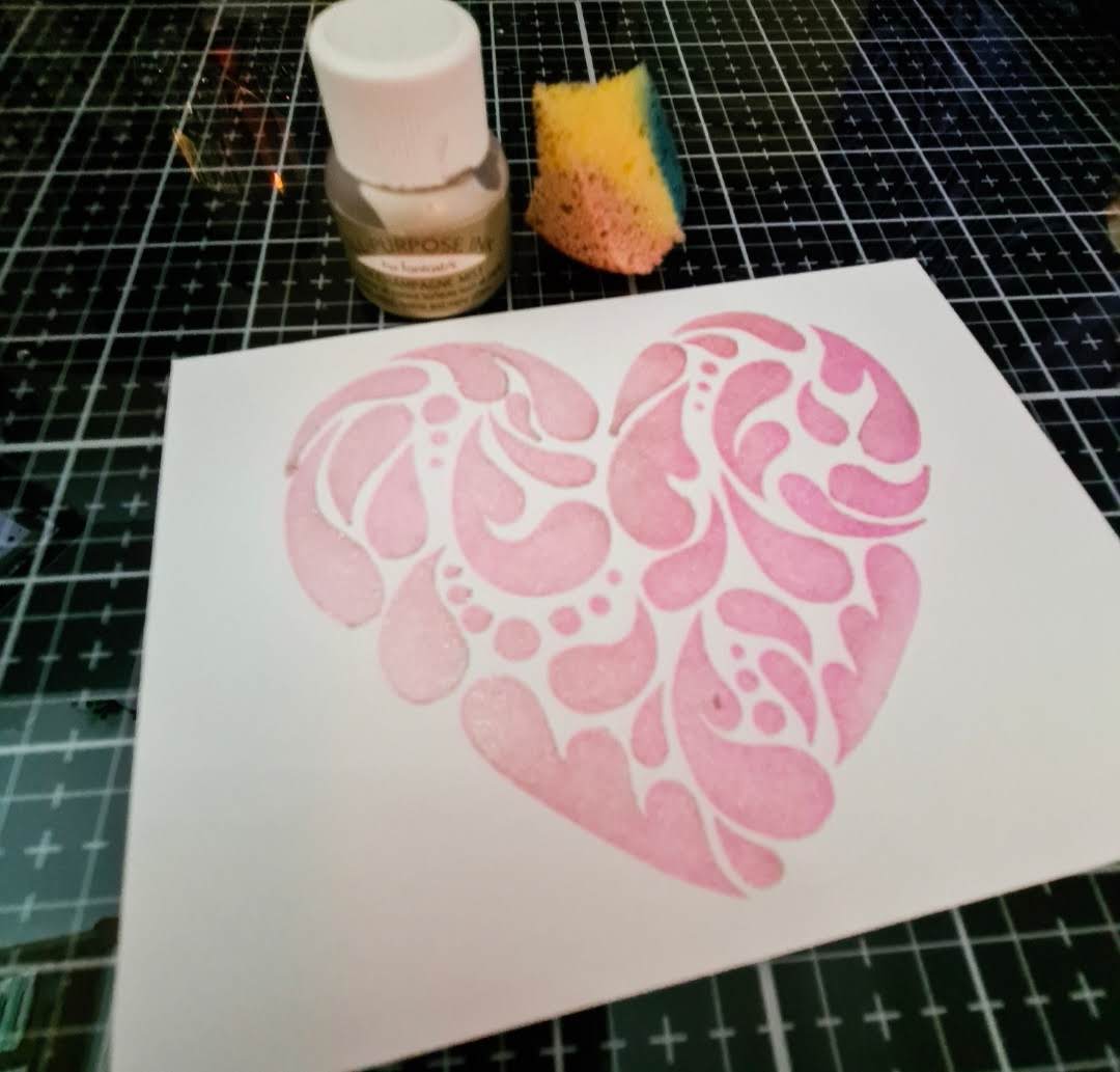
Card #1 - Celebration: Stencil Techniques
To create this card I wanted to focus on stencil techniques. I started with a 4"x5.25" piece of mix media cardstock and adhered the Flowing Hearts stencil to it. I then picked Rose Quartz, Cotton Candy and Puffy Heart inks and started to blend them over the stencil in an ombré pattern, going from lightest to darkest using a blender brush. And yes, my inks, blending brush and low tack tape all match lol.
While I still had the stencil in place and without removing it, I sponged on some champagne mist ink over it. I then removed the stencil carefully, so as not to smudge the ink. While it was still wet, I sprinkled on some clear embossing powder and heat embossed it, to give it a nice shine and to also help to prevent the champagne shimmer ink from smudging or coming off on your fingers and it also helps to seal it. The shimmer ink did soften the colours a bit and made it more of a pastel, which I really liked. This champagne shimmer ink has a very pretty slight golden shimmer to it.
ETA: when I switched blog hosts I lost a lot of my photos, so I have tried to attach as many as I could.
I then placed the stencil back on over top of the embossed image and
grabbed my DecoFoil adhesive pen and went over the 4 different groupings
of circles, so I could then add some gold foil on top. Next I
took some black foil, and while it is a foil it is not metallic like
most foils are, but rather has a nice shine to it, almost as if I went
over it with glossy accents. I then put it through my Minc machine on a
piece of toner sheet and cut out the Fancy Thanks die from the black
foil and then 2 more times from black cardstock. I glued them
altogether and adhered it to my stencilled cardfront. I then added some
craft foam to the back of it to pop it up from my card base and then
added a pink iridescent heart right under the thanks. I truly wish you
could see all the shine and the shimmer in the photos....it's really
very pretty!
Tips:
I have a super fine metal tip on my bottle of liquid adhesive, so it easy to get in small areas and onto delicate diecuts.
Heat embossing over an image will help to richen the colour and make it a bit more vibrant.
When
glueing on sequins or small embellishments, a liquid adhesive like
Rangers Multi Medium Matte is great, because it dries matte, so if any
leaks out the side or the embellishment moves around a bit once the glue
dries you won't be able to see it as it dries matte.
To
create this card I focused on dry embossing using stencils from the
Stencil Technique class and paired it with some floral stamp layering. I
got out my Elegant Swirls stencil and ran it through my manual die
cutting machine, using a silicone embossing mat rather that the usual
hard die cutting plates. I then set it aside and stamped out the floral
from the Regal Beauty stamp set using Frosty Pink, Rose Quartz, Cotton
Candy and Coral Berry crisp dye inks, stamped the leaves from the
Beautiful Day stamp set using Jet Black, Frayed Leaf, Forest Glades and
Evergreen crisp dye inks and finally the sentiment is from the Magnolias
For Her stamp set using Jet Black crisp dye ink. To finish I adhered
it all to my card base using foam tape and added the finishing touch of a
few clear sequins in various sizes. I unfortunately forgot to take some
process photos for this card.
Tips:
dry embossing will give your card a lovely subtle texture to it
using
inks from the same colour family when doing layered stamping will give
you a very pretty graduation of colour from one layer to the next
For
this card I wanted to try the letterpress technique that we had learned
in the Clean & Simple Class. The first time I tried it, I didn't
have great success, so I decided to try again. As they say....if at
first you don't succeed, try, try again. So to do this technique I
cut out the Mega Hello die 5 times from some 110lb cardstock that I had
scraps of and then a final time from some pink vellum. I adhered them
altogether and attached the vellum piece to the back of the hello. This
part is very important, as the vellum will be the side touching your
card front and when you put the hello on the paper, you don't want it to
be reversed (I hope that makes sense). The photo shows Coral berry ink
with it, but I used Frosty Pink.
Next
I took my Frosty Pink ink pad and smooshed it across the vellum hello.
By smooshing it across, you will get a nice and even application and
won't have the lines from tapping it on. Next I ran it through my manual
die cutter. This was very extremely tight fit and at one point I
thought it was going to up and break on me…thank goodness it didn't. I
then took some black and gold metallic paint and very gently splattered
them on the inked panel, as I didn't want it to overpower the hello. I
stamped out the secondary part to the sentiment from the Mega Greetings
stamp set in black ink and yes, although this is supposed to be clean
and simple, I felt that 3 pink ones were the perfect compliment to the
card. Hopefully you can see the impression the hello made into the
paper.
Tips
When
making a diecut stack for the letterpress technique don't add too many
diecuts to it at first. Try 4 or 5 at first and then add more if it
needs it. Everyones machine will be different too.
Once you
have inked up the vellum part of the diecut word, hold it by the edge
and very carefully place it on your cardstock, so as not to smudge the
ink and get it all over your cardfront.
When adding ink splatters a light hand is always better at first.
For
this card I did some layered stamping using the cupcake from the
Layered Cupcake stamp set and decided to make it a fun shaker card. I
first stamped the cupcake using Frosty Pink for the icing, Dew Drops for
the wrapper and Dark Chocolate for the cake and cut it out. I added
some small gold stars (same as the sequin mix for the shaker portion)
for sprinkles on the icing....I may have added 1 or 2 too many. I set
that aside and continued with the shaker portion. I took a piece of
trimmed cardstock and added a bit of texture to it by scoring lines at
1/4' intervals using my score board. I did a bit of ink blending on a
separate piece of paper using the same pink ink as the cupcake and also
used my Feeling Dotty stencil on another piece to add some interest
behind the shaker window. Next I cut out a circle using 2 circle dies
measuring 2.5" and 3" on the scored card front and also to create a
frame for the window from the ink blended piece.
For
the window I cut out a piece of acetate slightly bigger than circle and
adhered it to the back of the white scored piece and placed foam
adhesive all over the piece and especially made sure the window was
complete;y surrounded with tape, so as not to have any of the sequins
escape. I then placed the polka dot stencilled piece and placed a mix
of sequins where the window will be. I placed the scored piece on top
of the the sequins and applied good pressure all over. To finish it I
added the pink frame on the front and popped up the cupcake just to the
side. I printed out the sentiment using a girly kind of font to match
the feel of the card and gold foiled that using my Minc machine and
added some foam adhesive to it. And it's not complete without a few
matching sequins...you can never have too many. I think this is my
favourite!
Tips:
Adding score lines will add a subtle texture and some interest to plain cardstock
When adding foam tape to your shaker card, doubling it up is best as it gives your sequins more room to move around
To
cut down on the static on your sequins, add some non static powder to
them, the same as you would for heat embossing, before you add them to
your card so you don't have access powder on your acetate window
Use
the same colour of ink for your layered images, but inked up multiple
times for each layer, to get an image that has perfectly co-ordinated
colours.
For
this card I focused on doing some more stencilling...don't think I can
get enough of it. I stamped the large frame from the Fancy Frames stamp
set using Versafine Onyx black ink and heat embossed it using clear
embossing powder. Next I used the Feeling Dotty stencil and started to
blend Frosty Pink over it the embossed image, concentrating in the
middle and gradually fading out. Without removing the stencil I sponged
on some champagne mist ink over the pink. To set the ink I went over it
gently with my heat tool so as not to disturb the embossing already
done.
I
set that aside and stamped out 2 florals and 1 of the leaves from the
Wallpaper Art stamp set and did some very simple Copic marker colouring
with 1 marker for each, concentrating the colour more in the middle and
lightly flicking out. I had to be careful when colouring near the
black lines as I didn't use a Copic friendly ink, so I didn't want the black ink to bleed.. For the centers I
added some gold foil and went over it with my fingers to take a bit of
the shine of it. I cut the flowers out and added them to my embossed
card front. The leaves were glued directly to it and the flowers added
using foam tape. I added the sentiment in black from the Fancy Frames
stamp set and added it all to my card base.
Tips:
When
doing stencilling or ink blending over top of a heat embossed image,
take a soft cloth and give the embossed image a wipe after adding the
ink to remove any excess and make the image a bit brighter, especially
when done on white cardstock.
always be sure to use the proper
ink for the colouring medium you are using. Not all black inks are made
equal and for all techniques.
For a crisp black detailed heat
embossed image, use a black pigment based ink and clear embossing powder
over it. The pigment ink will stay wet long enough for you to heat
emboss over it.
When heat embossing over very detailed images,
it is best to use a fine detail embossing powder, as the powder granuals
are smaller than regular embossing powder.
When using a heat
tool on your paper, make sure to constantly move your the heat around so
not to warp the paper from too much heat in one area.
To
create this card I grabbed 2 pink alcohol inks, isopropyl alcohol, one
of the alloy inks and got to making! I started off by securing a piece
of Yupo paper to my wooden board with some painters tape and started
playing with my inks. I applied the ink in layers and dried each one
using my heat tool on the low setting. I also added a bit of one of the
new Alloy alcohol inks. I love it! I would normally use a straw or my
heat tool to help and move the ink around but this time I used a new to
me hand air puffer, designed for this very purpose. It also helps you to
get a nice wispy look to it.
I
then set that piece aside and started stamping my cupcake. I started
by stamping the outline image using Jet Black crisp dye ink, Dew Drops
and Teal Cavefor
the cupcake wrapper and then Rose Quartz and 2 other pink inks from my
stash and I stamped Dark Chocolate twice for the cake, so as to make it
appear like a nice dark chocolate cake. I used my Misti stamp
positioning tool for this as it helps to make the layered stamping alot
easier...at least for me it does. I added the gold sprinkles using my
DecoFoil adhesive pen and immediately went over them with some gold
foil. I picked a perfect sentiment from the Birthday Builder stamp set
and stamped it using the same black ink as the cupcake on a piece of
white cardstock. I then added foam dimensional adhesive to the back of
the cupcake and centered it on the inked panel, added the sentiment
across the wrapper and attached it to my card base. To finish it off I
added some rose gold sequins, which I was afraid at first as I had used
gold on the card and I didn't want to mix metals, but it turned out
perfect!
Tips:
When
using alcohol inks an ink blower is very handy to have. It helps to
give it a different look than using a heat tool....makes it a bit
softer.
Using a stamp positioning tool helps to get the layers perfectly lined up
When adding small sentiments or even a diecut piece a pair of tweezers holding the piece is quite helpful.
When
adding your stamped panel to your card base, it's easier to get it
perfectly centred if you stand up and look down directly down on it.
As
with the masculine set of cards, I wanted the packaging to co-ordinate
with the card set, so I looked through my rather large stash of
scrapbook papers until I found 2 that lent the feel I was going for. I
used the same recycled cardboard pieces for the base for my box, created
the top using 1 of the sheets of scrapbook paper and used the same
measurements for both the top and bottom. My dimensions ended up being 7
7/8" x 9.25" for the bottom of the box and then for the lid I added
1/16" to each of the 4 sides and it ended being perfect! I scored it on
all 4 sides and then on each of the 4 corners you end up with a little
flap where 2 of the scored lines interlap with another. For this part
you want to cut on one of the scored lines only and then cut out a
little indent here, so you end up with less bulk when folding the flaps
in.
Next
I created 2 belly bands with the paper I had picked out and then made a
flat style of bow using some burlap and lace ribbon. To finish it I
typed the A Gift For You sentiment, added some gold foil to it using my
Minc machine, cut it out with a tag die and tie it on with some metallic
gold striped twine. I am really happy with the packaging....it has the
same girly and feminine style as the cards within!
And
that's it for my level 1 assignement! I have really enjoyed this
challenge. it has most definitely stretched and pushed my creativity, in
most definitely a good way! I can't wait to see what's waiting ahead
in level 2.
Thank
you again so much for taking a few minutes out of your day to stop by
and check out my post. I hope you enjoyed it as much as I have loved
making these cards! They will for sure be heading off to a very special
recipient! Until next time...take care and have a wonderful and crafty
day! Michelle :)
Other Supplies Used:
Neenah
Classic Crest Solar White 80lb cardstock, Canson Mix Media paper,
metallic gold cardstock, black cardstock, white card base, Yupo paper,
Pretty Pink Posh Sparkling Clear Sequins, Metallic Rose Gold sequins,
Little Things from Lucy Ballerina mix sequins and sequin shaker mix,
white craft fun foam, Ranger Multi Medium Matte liquid adhesive, Tombow
Multi Mono liquid glue, 3M foam tape, Sookwang double sided tape, Gansai
Tambi watercolours, Distress Splatter paintbrush, Canon printer, Minc
machine, Brother Scan N Cut, DecoFoil gold foil, DecoFoil adhesive pen,
Martha Stewart score board, acetate sheets, Stampin' Up heat tool,
Tsukineko Chamagne Mist All Purpose ink, yellow sponge, Little B circle
dies, Stampendous Clear Detail embossing powder, Versafine Onyx Black
ink, Ranger Shell Pink and Pink Sherbet Alcohol inks, Ranger Alloy
Gilded ink, Ranger Alcohol Blending Solutionm, 96% isopropyl alcohol,
Tonic Studios guillotine paper trimmer, Picked Raspberry Distress Ink,
Wplus9 Piggy Pure Color Dye ink and Timeless Tags 2 die.
Today I am back with my final challenge to pass level 1 of the AECP! I have been working away on this for the last 2 weeks and am ready to show all my hard work. The past 10 classes have been filled with a lot of great and invaluable information and lots of fabulous techniques, both new and ones I've forgotten about and I've loved all of it so far. For this challenge I was given the task of making 2 different but coordinating sets of cards...1 set of feminine and 1 set of masculine cards, to design and create packaging for each set and also somewhere throughout this project I am to use a recycled element, which I have chosen to use on the packaging.
ETA...I have lost most of my photos for these except for a few, so I won't have many photos in this post 😞
I was also to chose 3out of the 10 class components that I have
learned in level 1, so for this I decided to focus on Easy Die Cutting
Techniques, Celebration: Stencil Techniques and For The Guys, although
there will be techniques from other classes used as well. I first went
about choosing my colour palettes. I decided to go with various shades
of teal with accents of gold, as I thought that it is a perfect shade
for masculine cards, it's fun and also lends a bit of a modern feel to
it....and teal and gold are perfect together! By using colours in the
same families throughout the set, it will help to unify them and make
them a cohesive set. I will also be sharing a few tips as I go along,
which hopefully may be beneficial to you.
This is going to be a bit of a longer post, filled with lots of
information, photos and some tips and tricks that may be a bit
beneficial to you. So sit back, get comfy, grab a beverage and let's
get started, so shall we.


.png)
