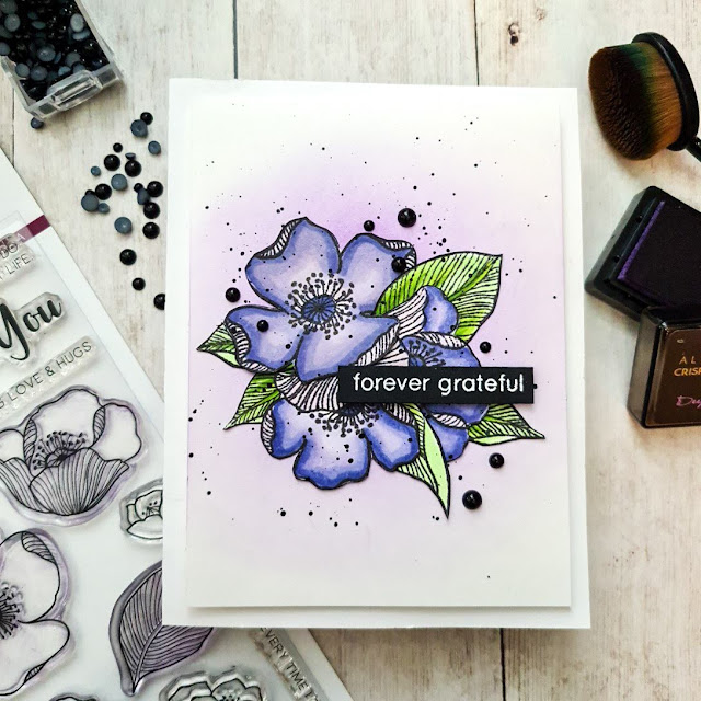
Hey crafty friends! So as you will have seen from my last post, I submitted my final challenge for my level 2 in the AECP program. Well I am back today with my first project for level 3. Yup....that means I passed level 2 and am now on my way to completing level 3! So I am very proud to display my newest badge 😃
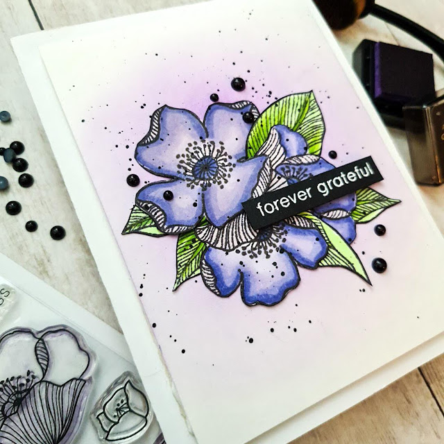
So for level 3 I am to do 5 classes of my own choosing. The first one I decided to do is the Elements of Floral Composition taught by Jaycee Gaspar. Jaycee is such an incredibly talented cardmaker whom makes the most beautiful floral creations! This class was jam packed with so much information...things that I had never thought of before but that make sooo much sense when it comes to designing floral cards, or non-floral as well. I actually struggled a bit with this class. As the class is titled, he goes over all of the different elements of designing a floral card. So many things I had never thought of before but they make so much sense and will most definitely be very practical to reference back to moving forward. As amazing as everything was that he taught in this class, to actually put it all to ink and paper is harder than it may seem.For my card today I decided to focus on colour, shape and where to place the sentiment.
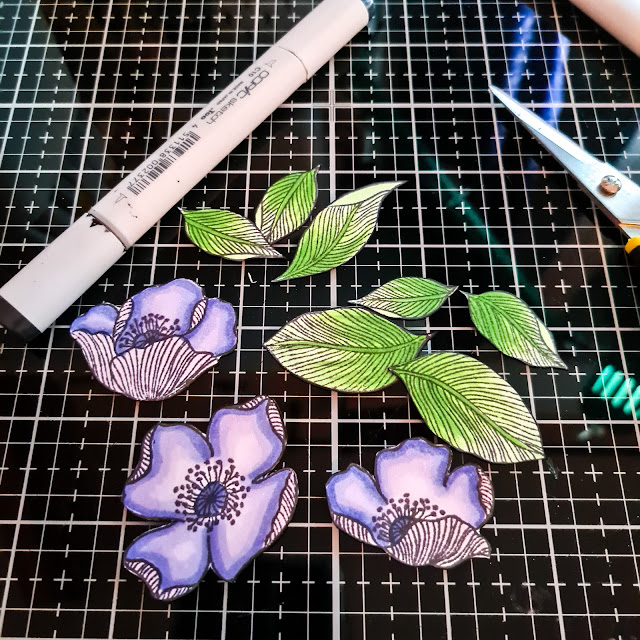
The first element that I referred to was colour. I used the 60-30-10 ratio, with purple being my 60, green being my 30 and then black (I hope that can be considered a colour) as my 10. I stamped out all of the flowers and leaves from the Adore You stamp set. I wasn't going to use all of them but was good to have them all done in case I made a mistake with 1 or 2 of them. It is always good to have those extras. I then started to colour them using my Copic markers. Once coloured I fussy cut them all and set them to the side.
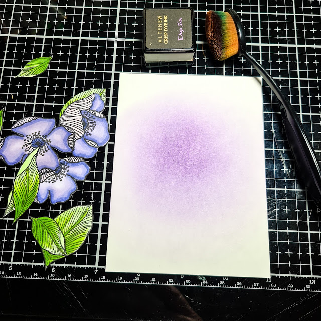
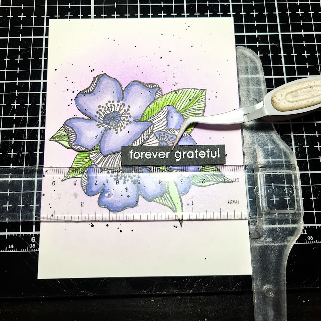
I didn't want to add too much to this card, to try and keep the focus on the floral arrangement, so I just did a little bit of ink blending on a piece of mixed media paper trimmed to 3.75"x5", so as to have a bit of colour coming out from behind the arrangement. I used Deep Iris for this to keep the focus on the purple and I think that I may have changed the colour ratio to 70-20-10 when I added the extra bit of purple. I then arranged the flowers on the front of the card and picked them up using some Press N' Seal, as Jaycee suggested in the class. The Press N' Seal is really very practical to use to keep your flowers exactly as you have arranged them, so you are able to add adhesive to them and place them right back in place. To bring in the element of shape, I tried to arrange the flowers and leaves in somewhat of a triangle. The flowers are but the leaves seem to be kind of a squarish' triangle....oops.
I tell ya...Press N' Seal is a very rare to find here. I went on a bit of a scavenger last year when I tried to find it....I was so desperate I was actually going to have my mother send me some from Canada, but luckily I found some at a specialty American food store here. But before I found any I used to take a photo with my phone and then I could reference back to that as to how I placed them. Anyways I digress lol So I picked them all up with a small piece of it and added liquid adhesive to them all and them added it all back to my ink blended cardstock.


.png)

Absolutely gorgeous, Michelle! We are almost at the end! Eeeek!
ReplyDeleteThank you for your beautiful submission.
Thank you Erum for your kind words and encouragement! Almost there:)
Delete