
Hello friends...today I have card to share with you for the Polychromatic class for my level 2 AECP certification. This class was taught by the very talented Nina-Marie Trapani and is filled with so many tips, techniques and lots of beautiful inspiration for adding colour to your cards. For my project I decided to focus on the lesson on watercolouring with similar colours or rather in my case....the same colour.

For this I unfortunately forgot to take photos of the process. I decided to use the Adore You stamp set and heat embossed some of the flowers and leaves onto watercolour cardstock using a White Satin Pearl embossing powder. I then grabbed a Zig Clean Color Real Brush marker in Persian Green and did some light watercolouring on the flower. I scribbled a bit of colour onto my glass mat and then added the colour that way, by laying down my water first and then the colour. I did a very light first layer and then went in with a second layer after the first had dried. I found I got much better results doing it this way, rather than the colour direct to the paper and then water. That way kind of left a dark line of colour where I added it and didn't really want to move much. You can see on the slightly larger flower at the top that it is darker at
the middle of it...those are the lines of ink that I laid down at first
that didn't really want to move with the water.
For the leaves I used the same Persian Green, but added a slightly darker green to give abit of a colour difference between the flowers and the leaves. However, looking at the photos now I am thinking I should have added a wee bit more green to them, as they are still very similar in colour in the photos. In person it is so much prettier!
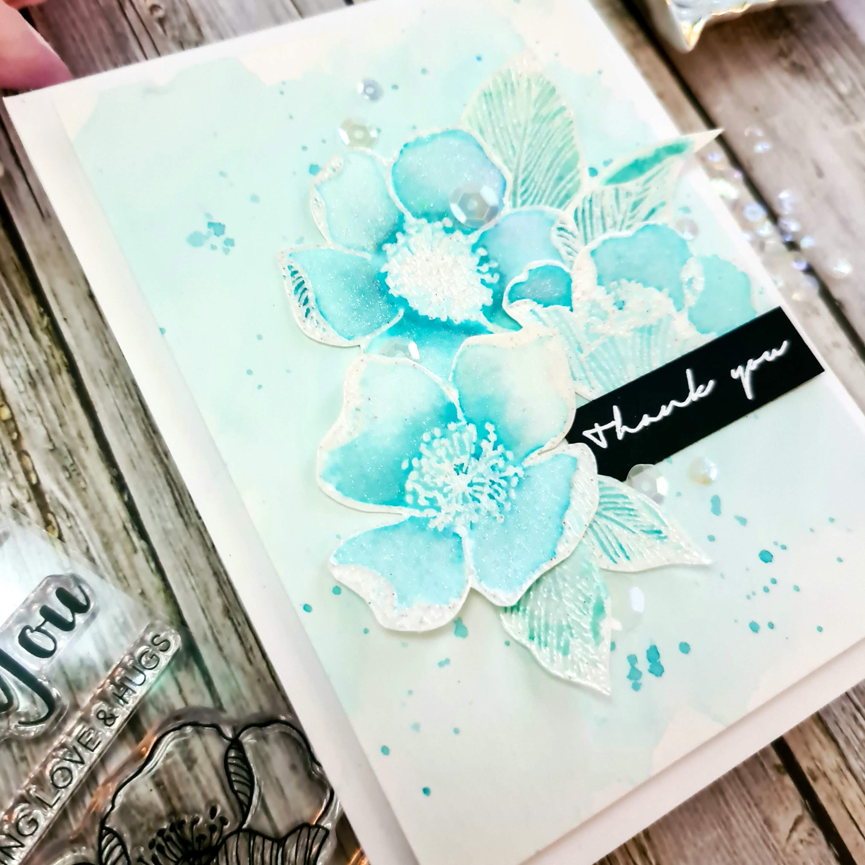
I set all my flowers and leaves aside to dry while I did my background. I used the same colour as I did for the flowers and spritzed my paper with water first and then added my colour directly from the brush marker to the water on my paper. By adding the water first, it allowed the ink to spread on its own and do its thing. I didn't add too much colour as I wanted it to a light wash of colour. I then set that aside to dry. While my background was drying I fussy cut out the flowers and leaves and added some sparkle to the flowers using a Nuvo Aqua Shimmer pen. The sparkle is sooo pretty!
For my sentiment I white heat embossed onto black cardstock a simple and delicate thank you from the Many Thanks stamp set
and then trimmed that down. Once my watercoloured panel was dry, I added some splatters of the same colour ink to my background for some added interest and then
trimmed it down to 3.75"x5", so that it had a border of 1/4" on all 4
sides and popped that up using some foam squares. To
finish my card I arranged my leaves, flowers and the sentiment on my
cardfront and adhered them directly using some liquid glue. To finish
it off I added some beautiful mother of pearl sequins. And that's it! If you would like to see the sparkle, be sure to head on over to my Instagram to see it!

I really enjoyed this class, although I did have a bit of a hard time deciding what I was going to do. I decided on this one as I really wanted to do a soft monotone watercolour look and I also need to work on my watercolouring skills. I really enjoyed this very colourful class and will be sure to revisit it and try the other techniques that Nina-Marie taught. It was a pleasure to have had her as the instructor!
I really hope you enjoy my card for this class, although looking at the photos I hope that I didn't go too light and that the colour isn't too close, seeing as I used the same for the background as I did for the flowers. It really is sooo pretty in person! And the sparkle 😍
A few tips I learned:
* adding your water first to your paper will help to possibly avoid any harsh lines left from the tip of the brush
* using the same or similar colours will give it a soft and uniform look and also you won't have colours that clash, especially when the colours blend
* always go light at first with your colour and then come back in and add layers
* adding ink or paint splatters adds some interest to your background. Be sure to use the same colours as you did the rest so that it all goes together nicely and so they don't take away from the main focus.
Products used:
- Altenew Adore You stamp set
- Altenew Many Thanks stamp set
- Canson XL Watercolor paper
- Versamark Watermark ink pad
- Hero Arts White Satin Pearl Embossing Powder
- Zig Clean Color Real Brush marker Persian Green 033 and Deep Green 044
- Little Things from Lucys Cards - Mother of Pearl sequin mix
- Nuvo Aqua Shimmer Pen - Glitter Gloss
- black cardstock
- Ranger Multi Medium Matte liquid adhesive
- Art Glitter Glue
- foam squares
- Nuvo
- white top folding A2 cardbase


.png)

Super duper pretty!! Looks ethereal.
ReplyDeleteThank you for submitting your work to the AECP assignment gallery.
Thank you for your kind words! I wasn't too sure if it was too close in colour, but I really like the softness of it.
Delete